A website redesign that turns visitors into enquiries
A full redesign of the Easy Medical Device website, driven by data: a clear message, one main button and visible proof, replacing a crowded site with no clear next step.
Compare the old and the new site
The real old and new Easy Medical Device websites. Drag the handle to compare them and scroll the full page. The results numbers are samples.
- Drag the handle
- Scroll the full page
- Switch between old and new
- Read what changed
The website: before and after
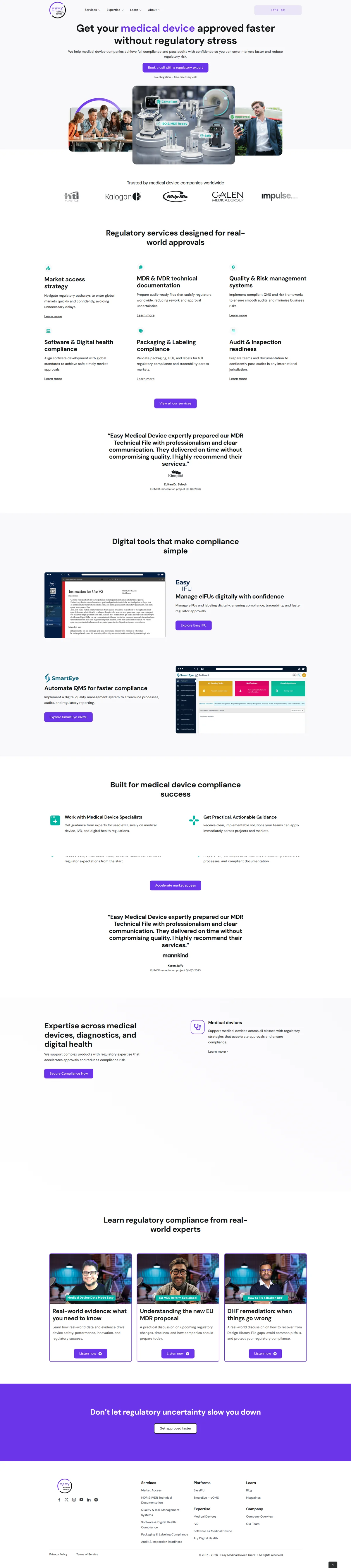
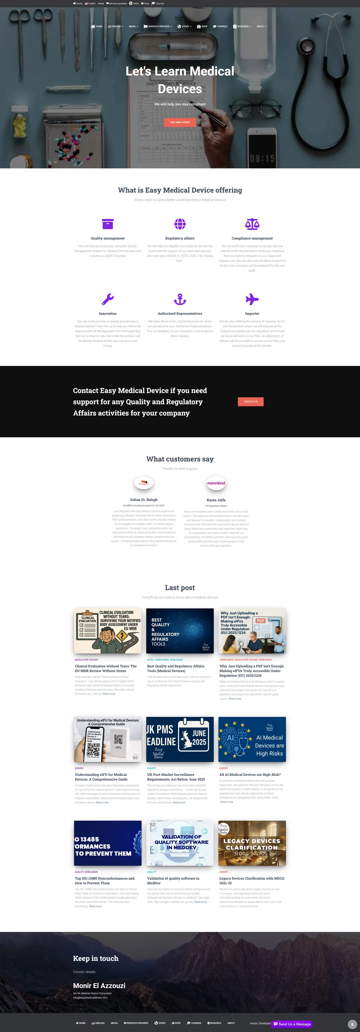
Drag the handle to compare the old and the new design. Scroll to see the whole page.
▲ Real screenshots of the old and new website. Results numbers are samples.
Data first
Analytics, heatmaps and recordings showed where visitors dropped off before a single pixel was changed.
One message, one button
A clear headline and a single main call to action replace the crowded menu and long text.
Proof above the fold
Numbers and trust signals appear before the visitor has to scroll.
Shorter forms, faster pages
Fewer fields and a mobile-first build, tested before and after launch.
The idea
The old site had plenty of traffic and very few enquiries. The goal was not a prettier website, but a clearer path from first visit to first message.
What I built
The analysis, the new structure and copy, the design, the build, the form and tracking setup, and the A/B tests that followed the launch.
Under the hood
Let's connect.
If you liked the work or want to talk about it, say hello on LinkedIn.

Hicham Benataiba
Digital Marketing Expert at Easy Medical Device | Growth Marketer & Full-Stack
Kenitra, Rabat-Salé-Kénitra, Morocco · Contact info
3,666 followers · 500+ connections